B2B Saas
Troubleshooting integrations
Project description
Amazon business’ intergration offerings are manifold and help our customers connect amazon business’ offerings into their purchasing system to shop, send orders, track spending, reconcile invoices, and pay for purchases. However, there might be some issues around order rejections, PO formatting errors, etc which can cause significant delays if not addressed immediately, causing a bad experience for customers, but affecting their bottomline and trust in Amazon Business as a supplier.
KPIs
Reduction in customer support tickets
NPS score
Cost savings for Amazon Business (through support teams human-hours)
Impact & Outcome:
62% reduction in support tickes
(Goal: 45%)
$72M saved through human hours on support teams
(Goal: 50M)
Increase in the NPS score from customers by 3 points
(Goal: 3 points)
The Problem:
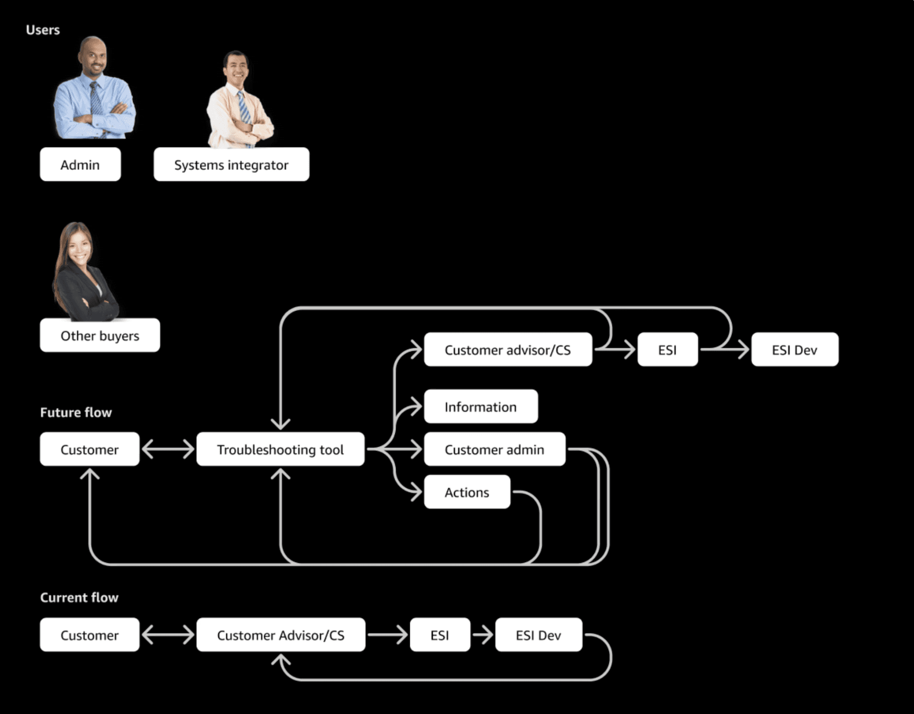
An integrated customer relies on a Solutions Architect to setup the integration or does this in a self-serve manner. During the setup, the customer faces multiple issues – mapping of specific fields, data transmission issues and order processing. Post go-live, the customer faces issues on system outages, transmission failures and errors, order rejections or issues related to their Punchout setup. In order to troubleshoot and fix these issues, the customer first reaches out to Customer Advisor or CS, who would then engage ESI – Integrations team. The integrations team may be able to identify the root-cause independently or may need further support from ESI Dev team. This is both a reactive and a time-consuming approach. We need to build tools that allow the customer to self-diagnose the problem and fix it faster. Such tools will allow us to fix issues faster and safeguard the CX associated with such issues.
Specific Challenges:
Error types vary vastly across different kinds of orders, with some customer actionable and some actionable only by Amazon's internal teams
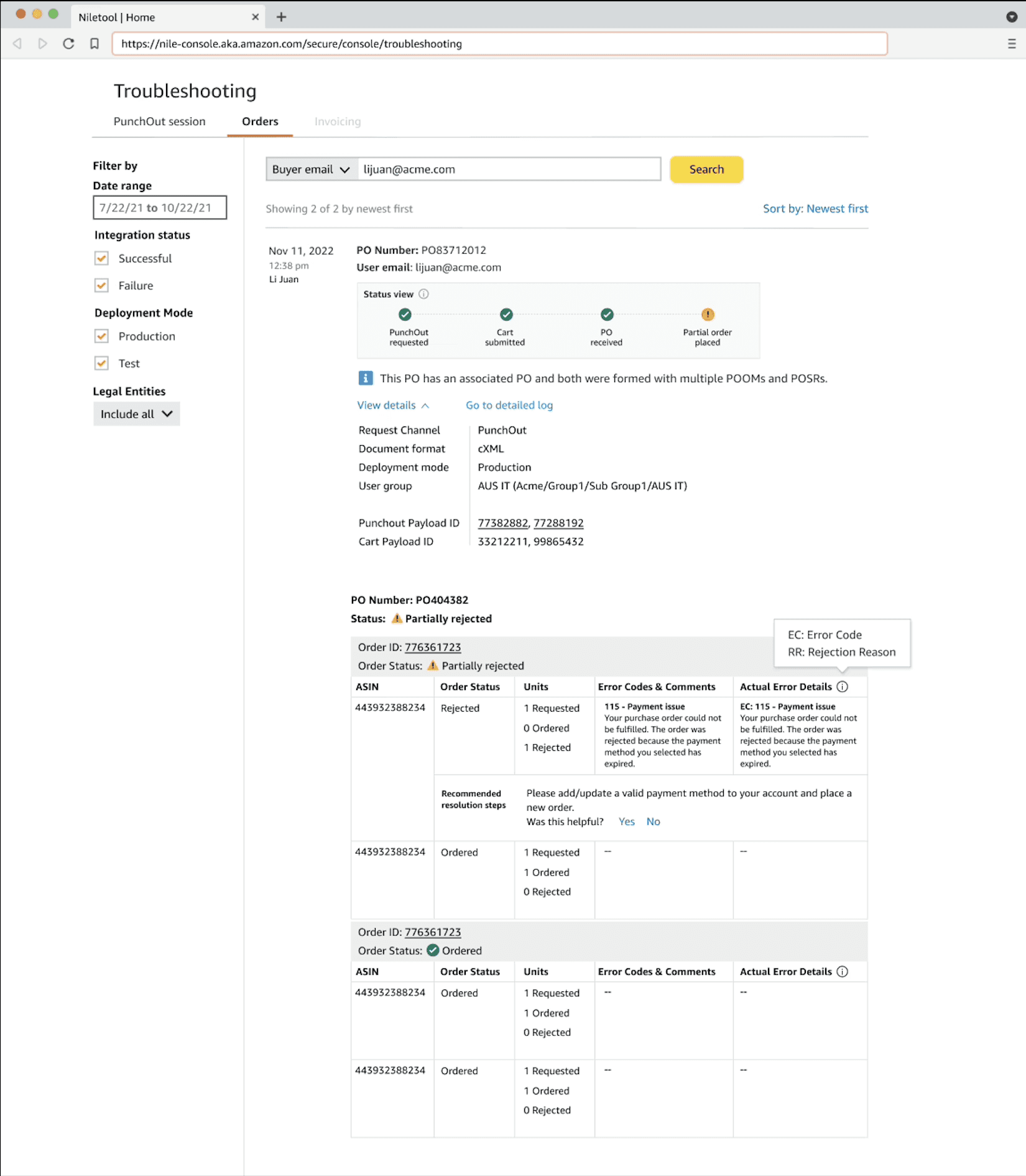
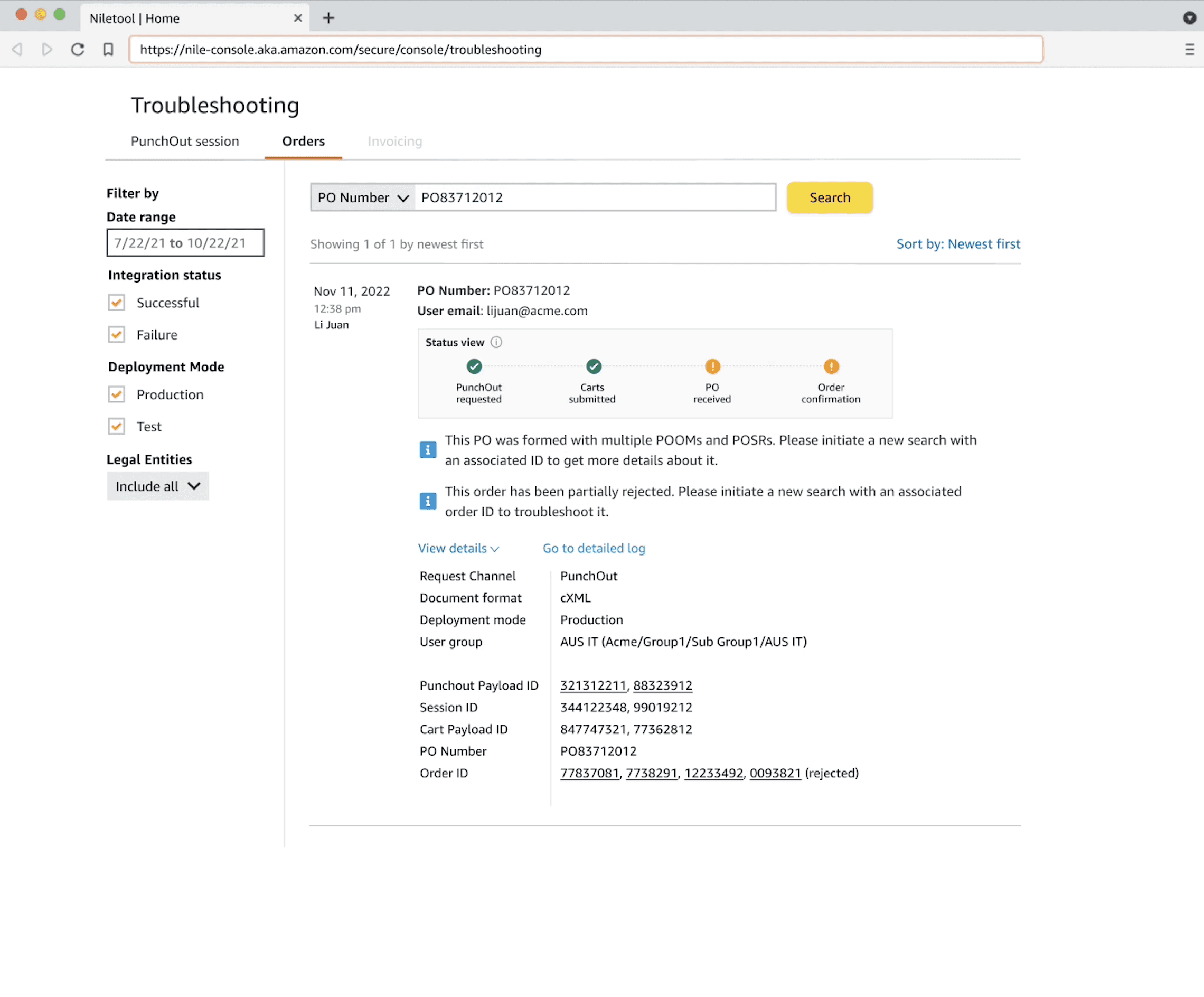
Order rejctions can get complex especially if it a partial rejection through item type and item quantity (ex. 5 qty of 10 among 1 of 3 items rejected)
Communicating complex partial order rejections with differing reasons at once can be complex information for customers.
Understanding the Users
This category details the step-by-step approach taken during the project, including research, planning, design, development, testing, and optimization phases.
Size and Segment
Primarily large scale CPS users in NA and EU, with procurement and technical roles defined clearly.
Pain points:
For order rejections, customers primarily want to get the items they have ordered as soon as possible.
Customers may not understand nor care for the information on the errors that occurred. They might just wnat ot resolve them and get their items.
Technical roles on the customer's organizations might want to identify and actively take steps to prevent common errors from occurring frequently on an account.
Ideal experience / customer journey
Contrasting the current flow of how errors are resolved versus how the troubleshooting tool would fit into this process helped me better understand the possibilities and intricacies of how this tool will be used, and the common and outlying edge cases.
Categorizing the errors through their resolution type - Resolvable by anyone on the customer side, resolvable by specific roles on the customer side, resolvable by amazon and finally, just informative has helped me better frame the potential design ideas in my head.
Besides this, customer must be able to quickly get notified of any errors, allow a certain time to quickly resolve them, or delegate them to other users on their account. They must not be delayed of their orders.
Quotes / research data:

“Order rejections are frustrating to us since we are not notified immediately, and even when we are, the resolution is usually getting on a phone call or a long email thread with cusomter support teams. I need my order, and fast”
Timeline and planning
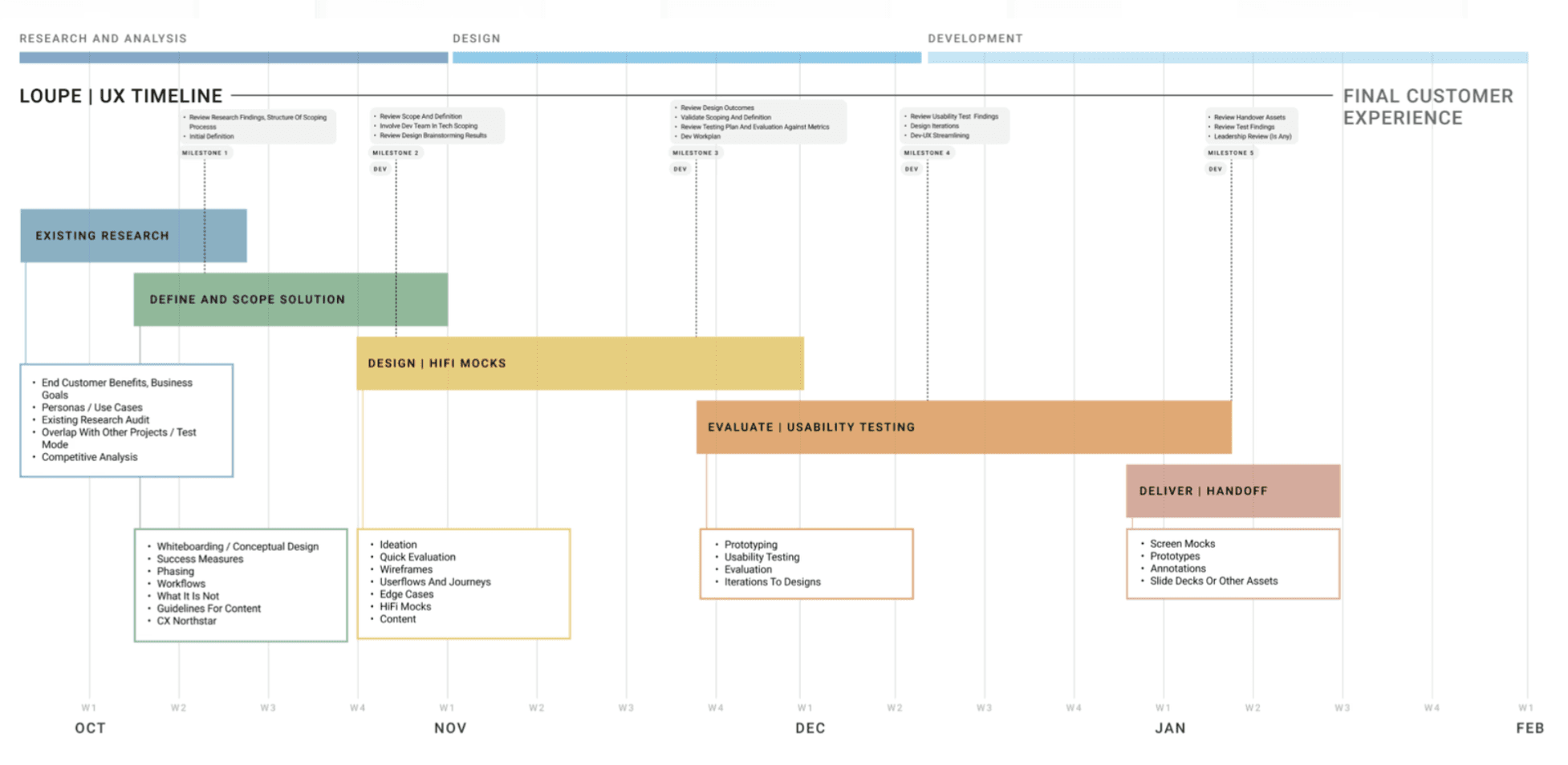
As the effectiveness of the tool depends entirely on its usability, we decided to dedicate a large segment of the timeline to the usability testing for the design.
Process and Iterations
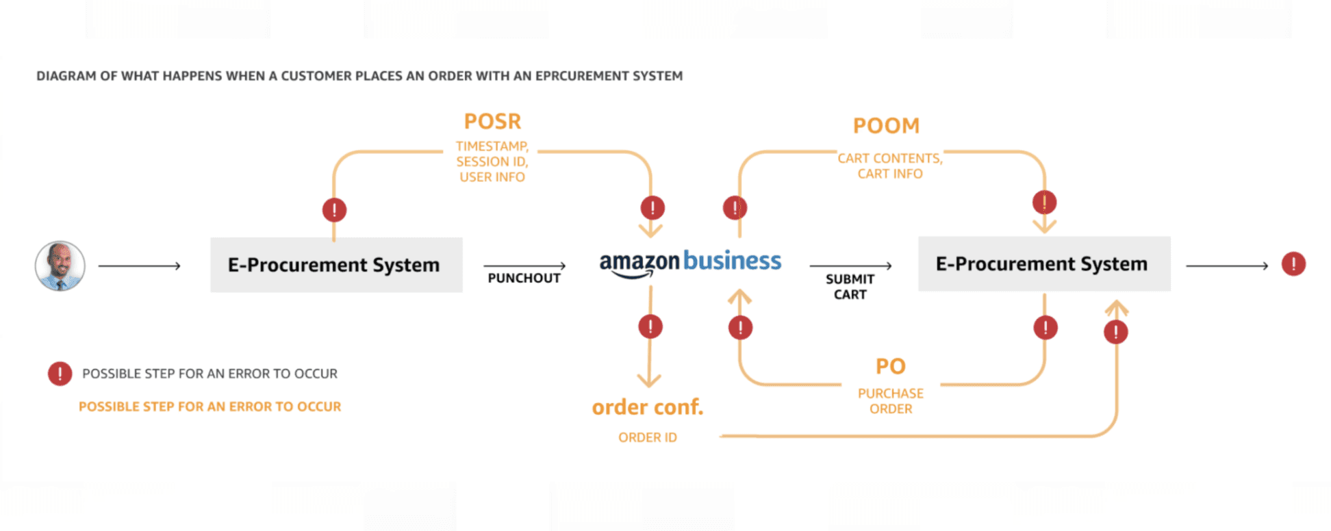
The first step was to understand the linkages and journey of when an order is placed, and all of the other tags it gathers through the process. Order to PO, partial split, and shipments and so on. Understanding this gave me a map of where all the errors can potentially occur.
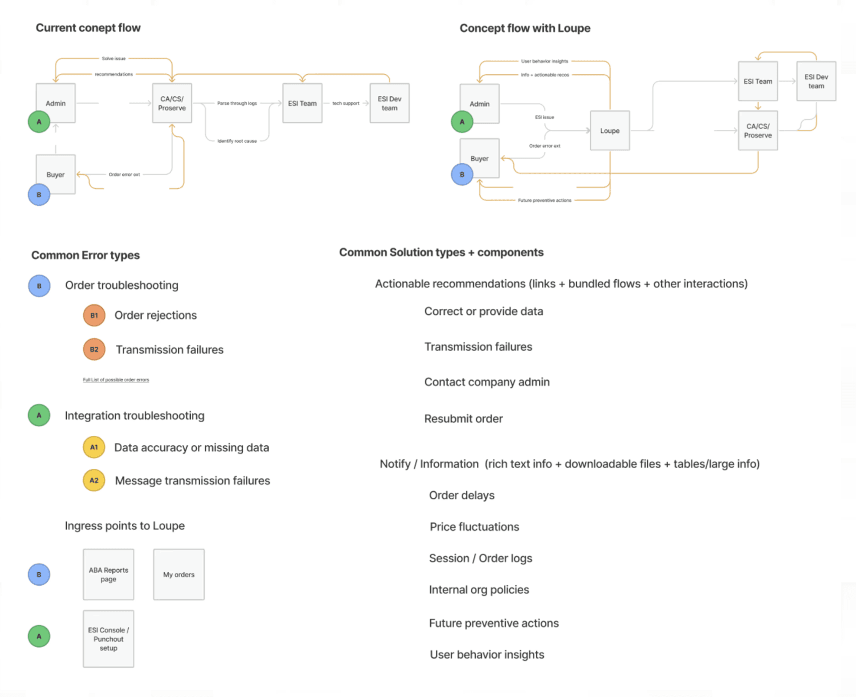
After mapping out the potential points of errors in the ordering journey, I tried mapping out teh actors in this process, their potential actions, mitigation mechanisms and so on to get a better understanding of user actions and steps overlaid on top of the system process of order generation and shipping.
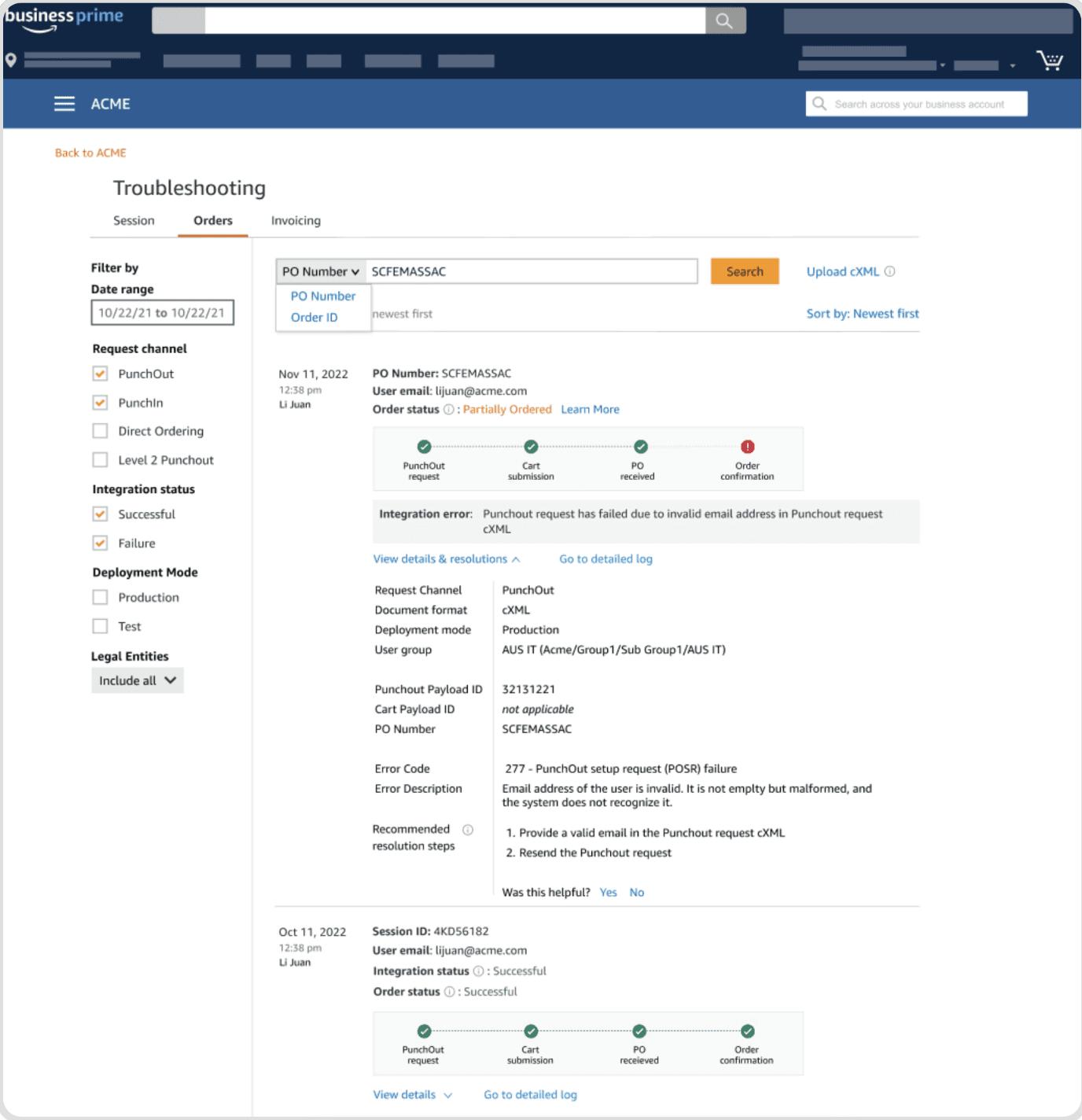
This was translated into an early version of the design (I started only designing in high fidelity at this point to ensure I was covering all potential cases and customer actions)
Next, I went to map the different kinds of errors possible that result in order rejections, and trying to see if they can be categorized according to cause, or resolution action. Since there were multiple possible errors, with different permutations and combinations, I mapped them all out, totaling a count of 40 possible errors.
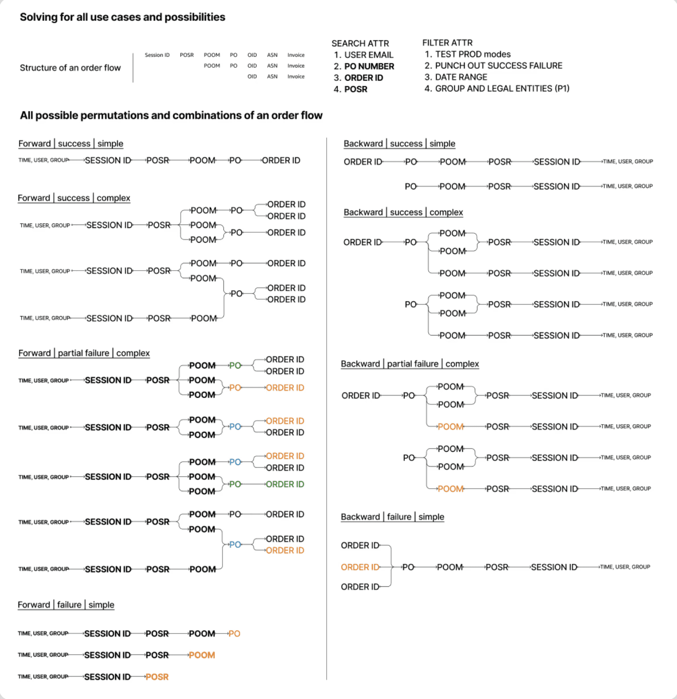
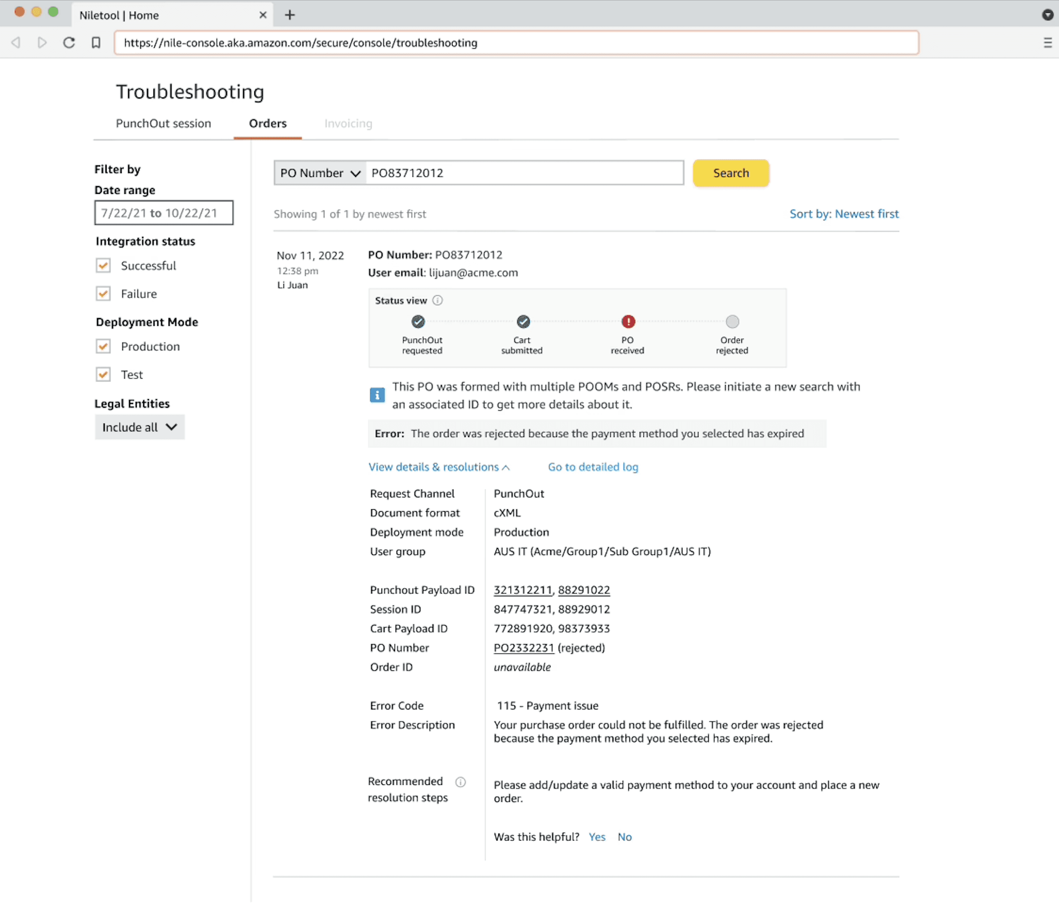
Once the super set was defined, I was able to group them together through resolutions types - as simple resolutions, complex resolutions, and amazon actionable resolutions. Customers could also keep a track of these issues in a singular place throughout.
Information architecture was a key factor here to communicate complex use cases around aprtial rejections and splitting of an order into partial orders and so on.
Design & decisions
Information architecture was a key factor here to communicate complex use cases around aprtial rejections and splitting of an order into partial orders etc.
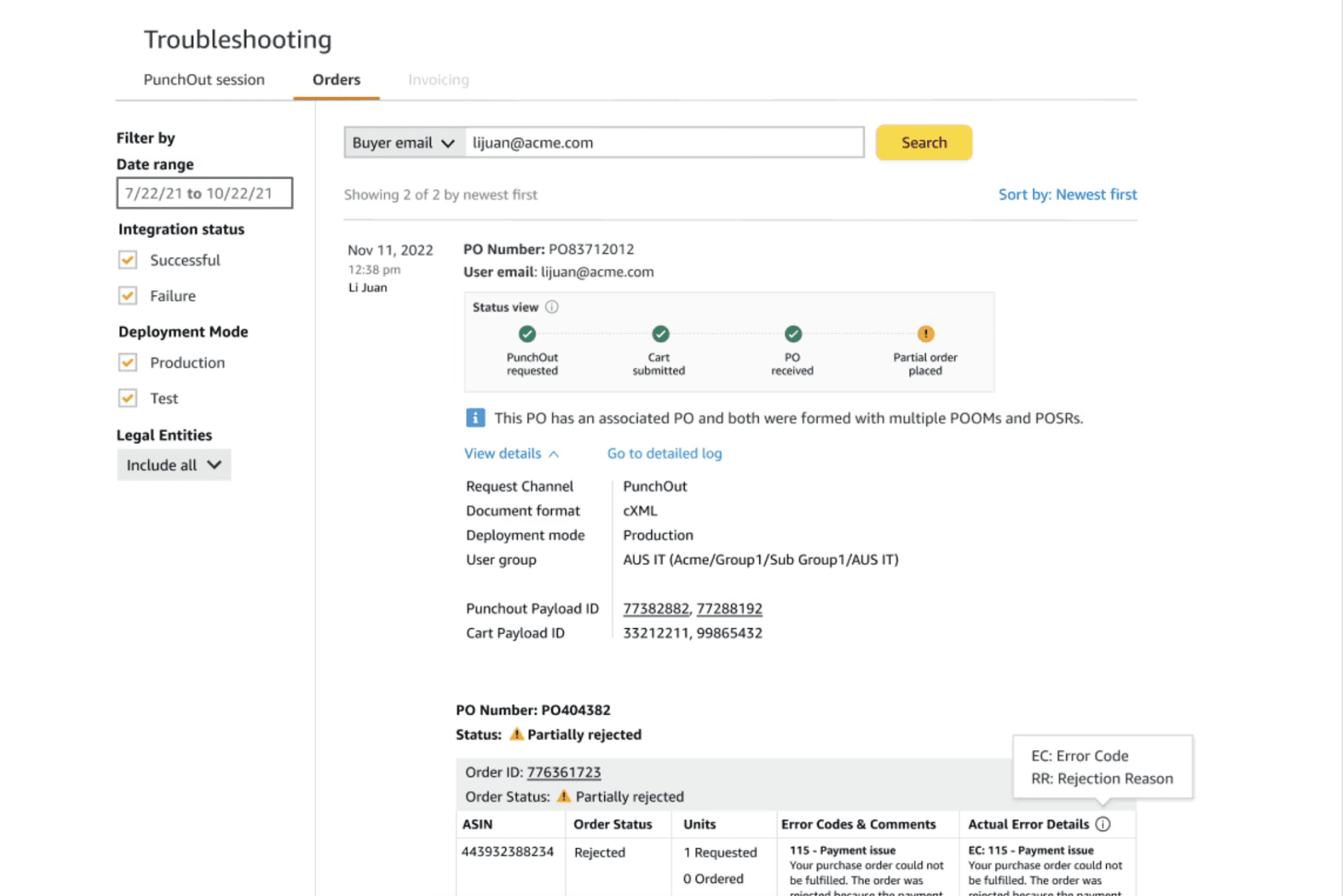
Investing heavily in the process to understand the possible outcomes, order flow structure combinations, and everything else related to it helped me translate these ideas into a dashboard which could address any potential use case effectively.
Results
Outcome and Impact
The product was able to perform as expected and exceeded some of our goals in the case of reduction in support tickets (62% actual vs a 45% goal), cost savings for Amazon business through the human hours saved by the support teams ($72M annual vs 50M goal) , engagement with customers, and finally the NPS score that the customers gave Amazon business integrated order troubleshooting.
Learnings & Retrospective
In the B2B world, sometimes there is just complex information to communicate to the customers in terms of an interaction. Rely on information architecture and just visual layout in this case.
Solving for an ideal information architecture can help break complex information in a more digestible way for customers. A good UX could just be a great information architecture.
The possibilities might be many but as long as they are not infinite, investing heavily in the process to understand and map them out can make thinking and navigating through them easier in the actual design.


